Evaluating PYRAMID's Global Navigation
Using a hybrid research method to improve navigation ahead of new product categories.
Project dates: November-December 2021
Company: PYRAMID

Background
Business Context
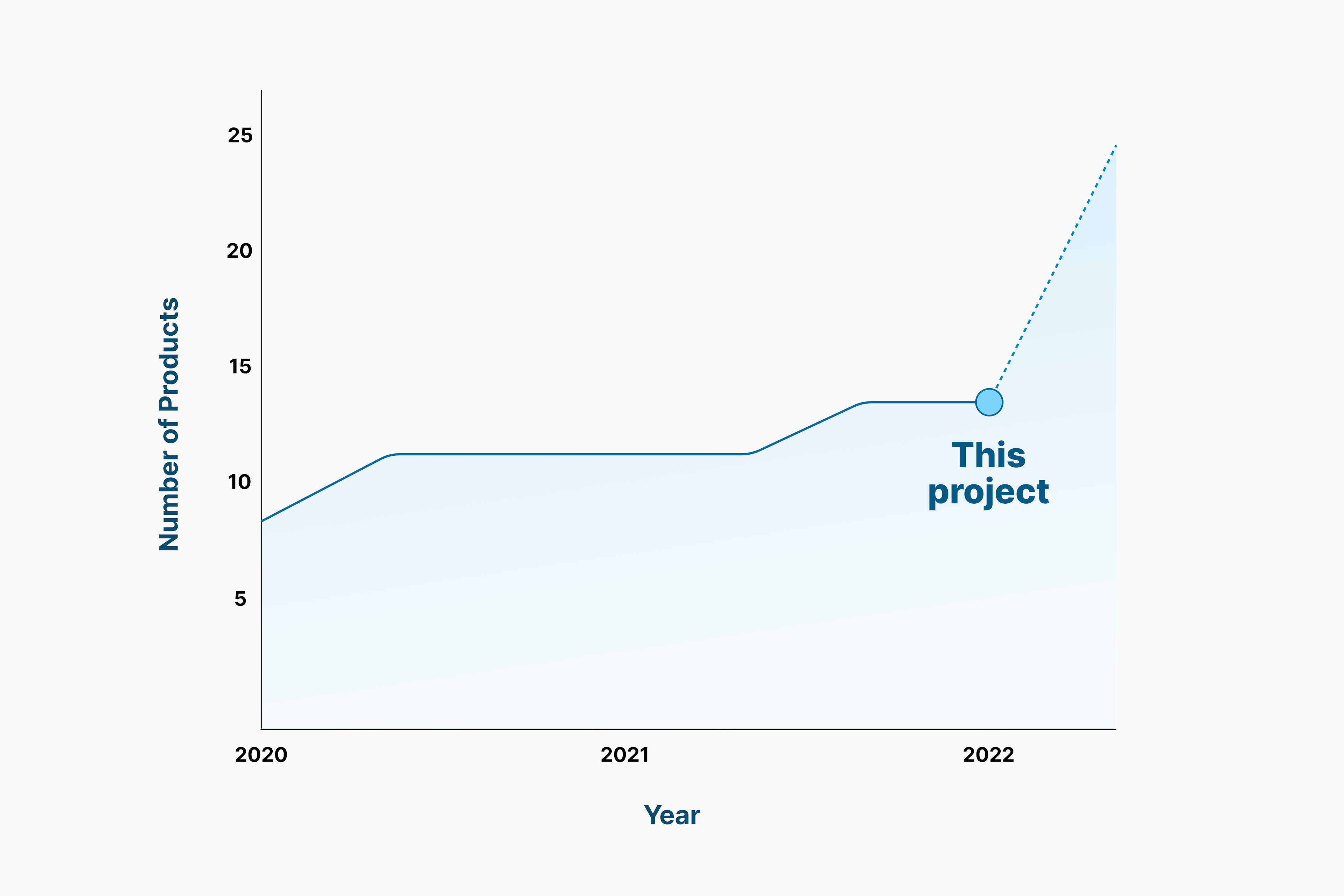
PYRAMID planned to expand their online product offerings by up to 80 percent in Q1 2022 through a merchandise partnership with Printful. Merch is a novel product category for PYRAMID — having only sold the occasional T-shirt in person previously — which would additional space in navigation to accommodate it.

Software Development Context
Coincidentally, our product roadmap contained a major website update, Ochre 3.0, scheduled to release in late December. This update added support for Shopify's Online Store 2.0, boasting improvements in speed, customization and accessibility. It also brought full compliance with Ochre, PYRAMID's design system.
Why focus on navigation now?
Ochre 3.0 centers around building foundations for PYRAMID's website to compete in a future of hybrid fitness services. Information Architecture is perhaps the most important foundation of an online store. How we categorize, label, and arrange our pages/products determines how easily customers can complete their jobs to be done.
The previous navigation element arrangement was the result of a generative Card Sorting study from 2018 that I had covered here. Since customer arrangements.
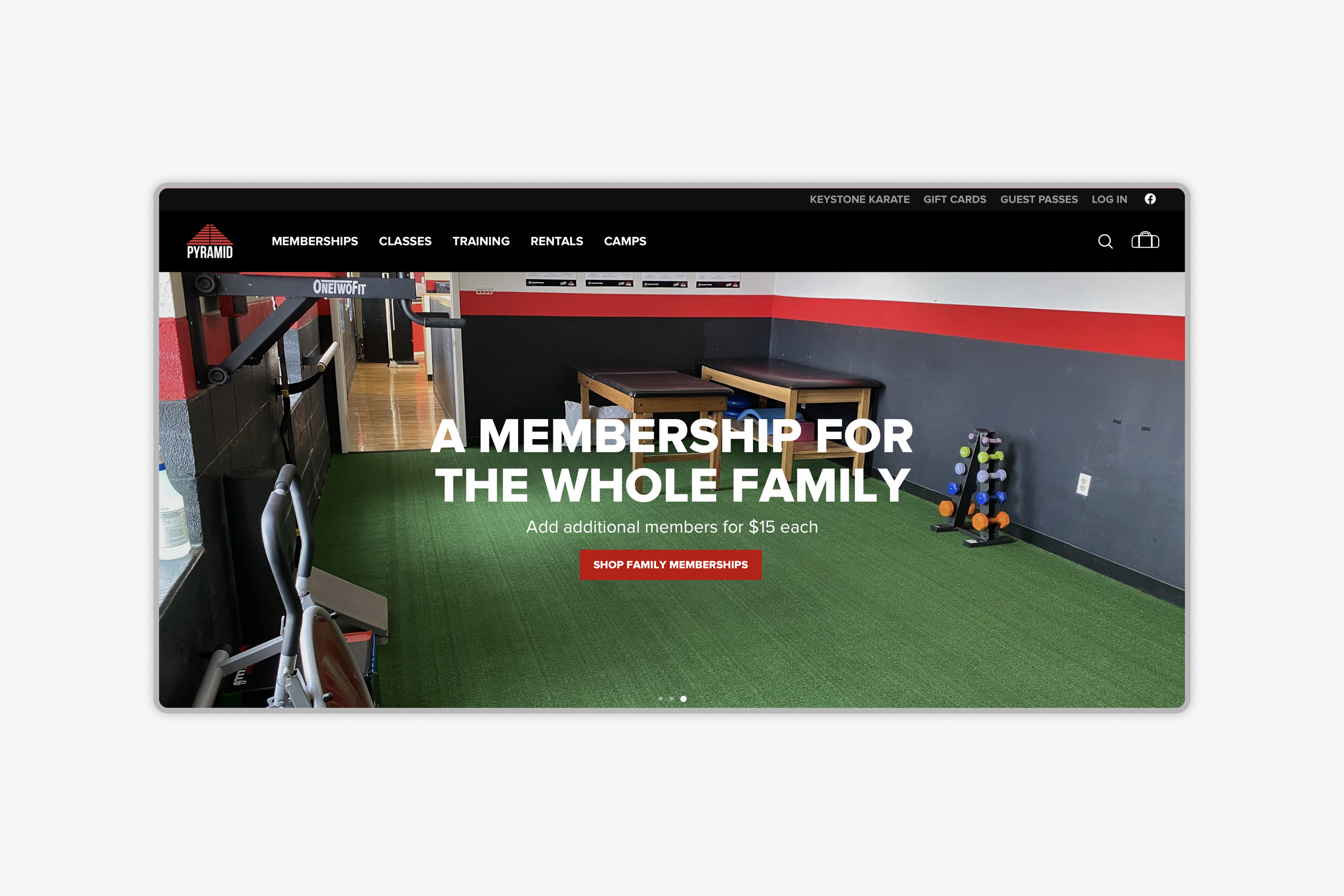
Previous Navigation Element Arrangement
The intersection of a need for nav this was the perfect time to evaluate whether customers' mental arrangements of products matched those of our website. Any mismatches could be corrected in the coming update.
Planning
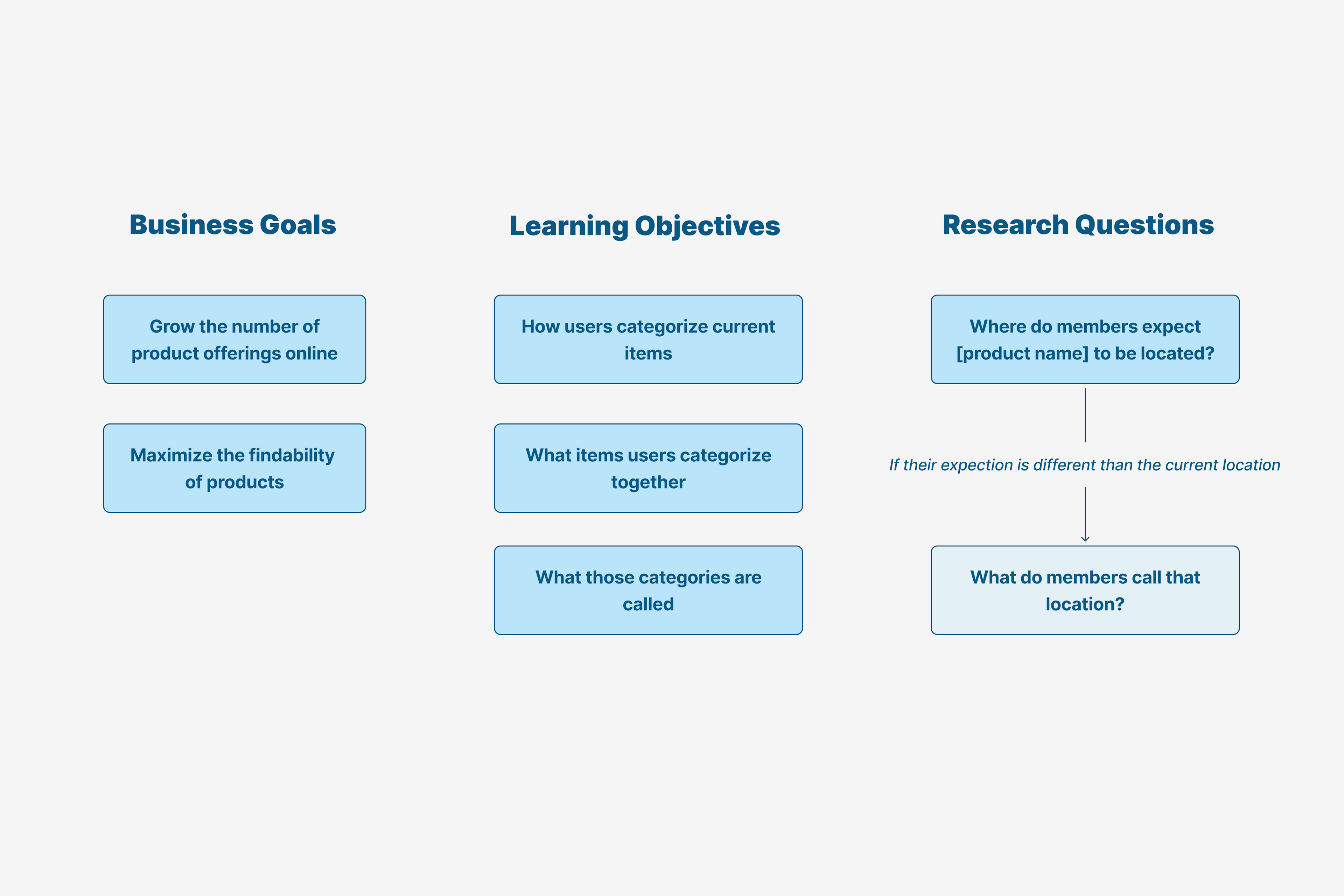
Defining the Problem Space
To definine the problem space, I ran a stakeholder workshop to define the business goals relevant to the project, along with learning objectives, information that would help to achieve those goals. From there, I converted those methods into testable research questions.
Desk Research & Method Selection
Before selecting a method, I wanted to take advantage of the opportunity explore Information Architecture research methods. I read this article from UX Matters on IA methods, and selected chapters from Peter Morville and Louis Rosenfeld's book on IA for the web.
Initially, I expected to approach these research quesitons with a tree test, followed by a generative method in the event of disagreement. Instead, I found the approach of using a hybrid card sorting method to be a more efficent way of answering generative and evaluative questions at once.
Publishing a Research Plan
Before executing research, I shared a Notion document with my stakeholders containing a brief background, a kanban board of research methods to indicate progress, and a section for scripts and deliverables.
My goal when writing research plan is to provide stakeholders a skimmable overview of what I'm doing and why I'm doing it. More depth can be saved for the reporting process.
Methodology
Hybrid Card Sort
To reach a correlation coefficient of 0.95 in a card sorting exercise, Tullis and Wood recommend a sample size of 30 participants. Since the population of interest was all online visitors, a sample of 30 members who had visited our website in the past month were recruited for the study. Participants were recruited after their workouts to complete the study in a private space adjacent to the club lobby.
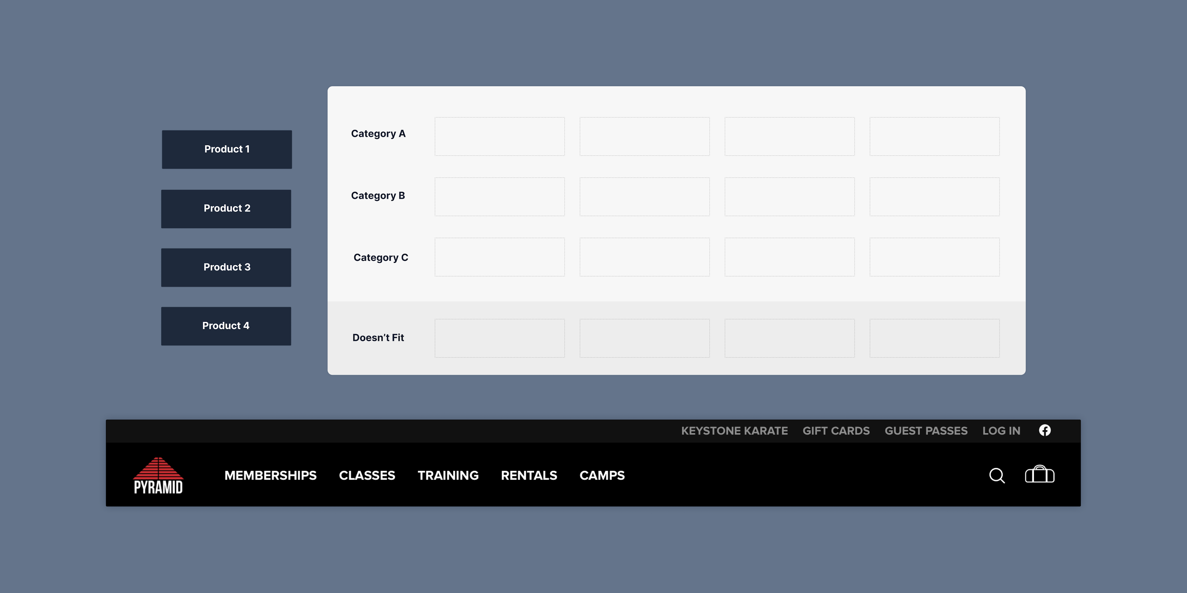
Participants were presented a two-column FigJam space, pictured below. Participants dragged cards representing products from the left column into the appropriate row representing its navigation category. If participants felt that a card did not match any category, they could place the card into a miscellaneous category at the bottom of the column, where they could suggest a better navigation label.
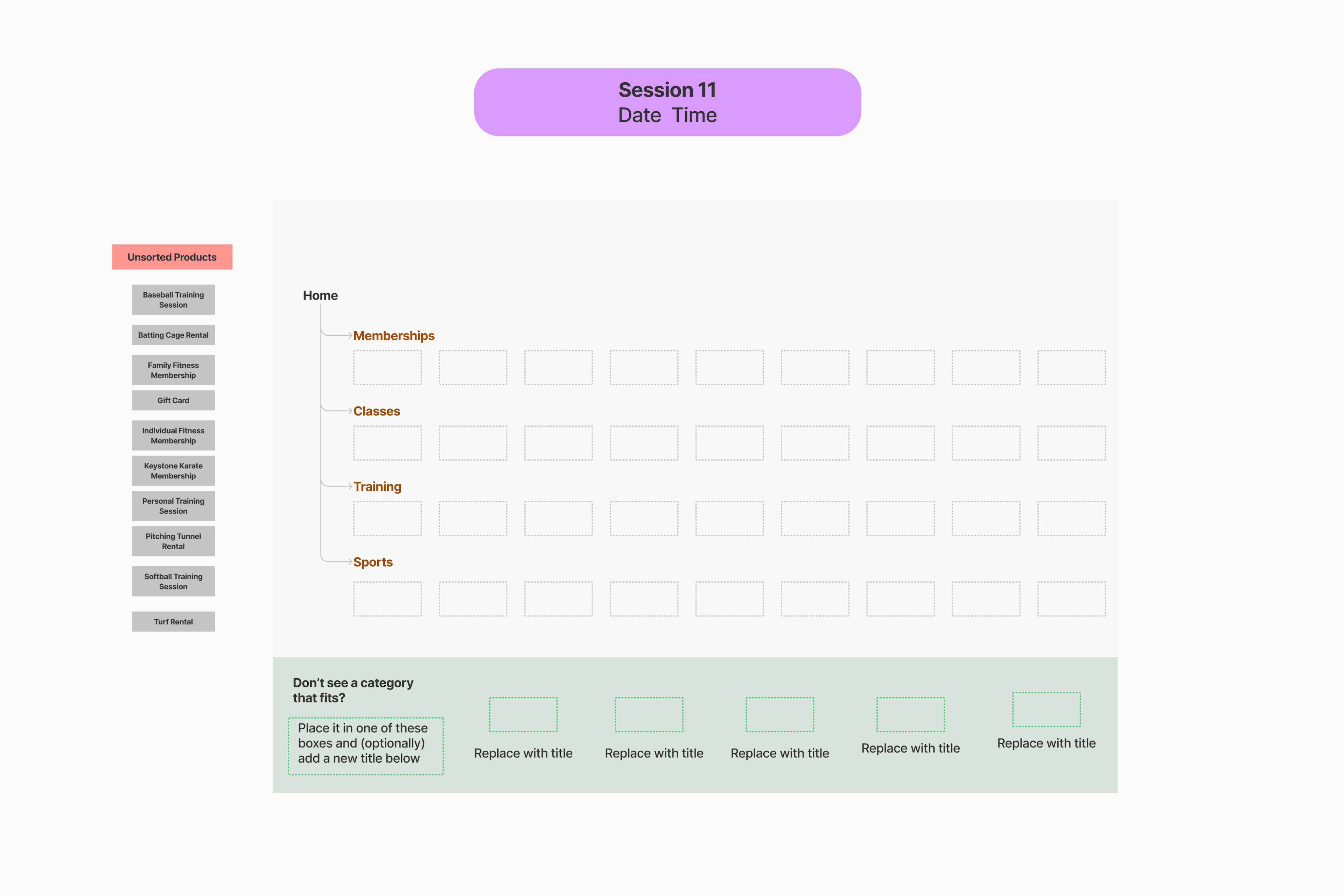
The navigation element Karate was omitted as a row from this exercise to evaluate whether participants placed Keystone Karate Memberships in Sports or Memberships. A consensus among participants would warrant us removing Karate as a navigation category, given its relatively narrow scope.
On average, each participant took about five minutes to complete the exercise. When they finished, I gave participants the option to explain any choices or share anything that they found confusing. Importantly, such feedback led to our offering participants a mouse in later exercises, after a participant shared that they struggled to use a trackpad.
Synthesis & Analysis
Calculating Percent Agreements
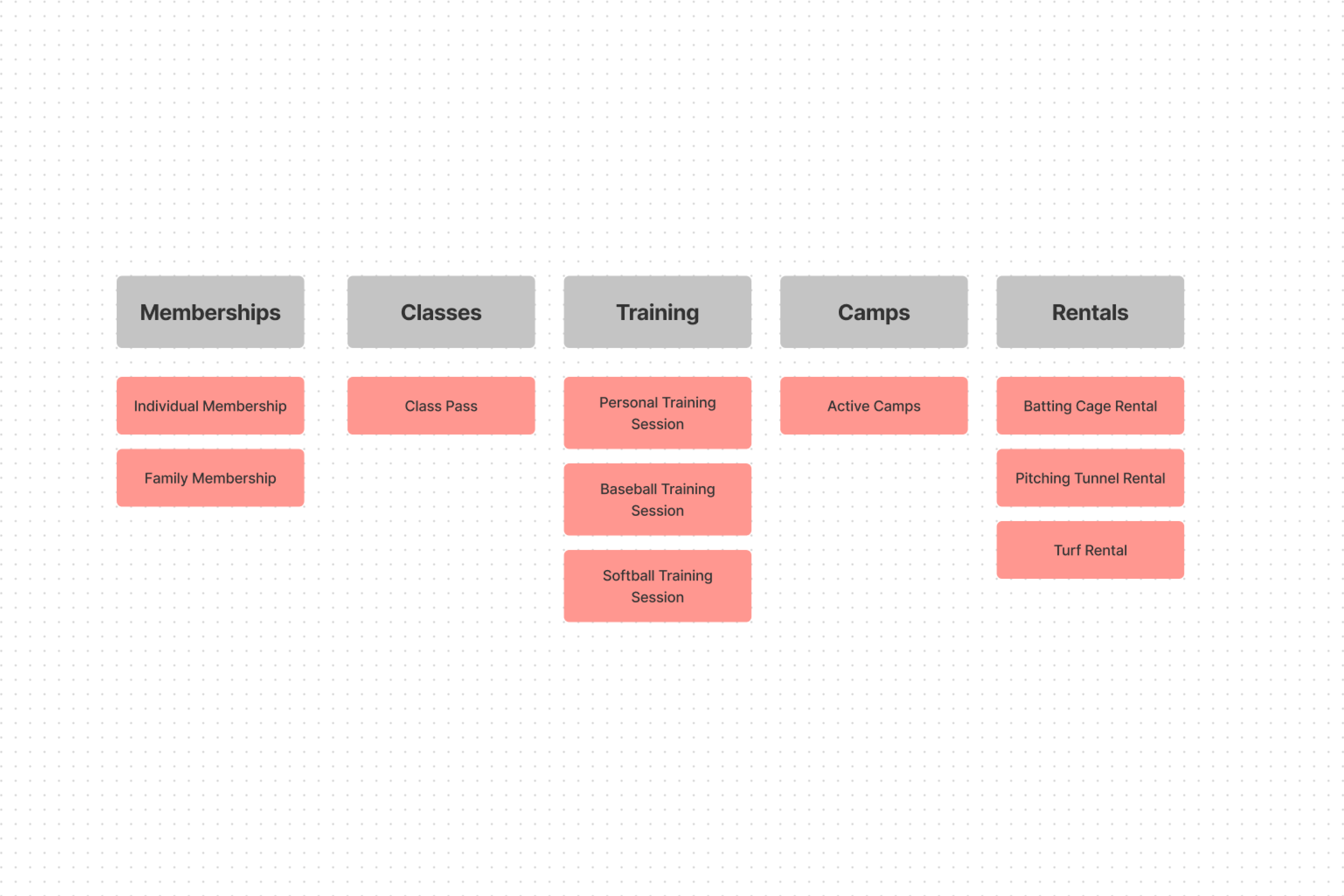
To understand the relationship between arrangements, I placed each product on the first column of an Google Sheet, and each product category on the first row. I calculated the frequency of each product appeared in each category, and calculated its relative frequency. When evaluating the relative frequencies, products that lacked a 0.7 frequency in one category were considered to be out-of-place. From there, I was able extrapolate a few relationships about the previous navigation structure.
Takeaways
Sports is too broad of a category to offer a strong information scent. The previous navigation strucutre used Sports as a catchall for Sports Rentals, Sports Training, and Sports Camps. Participants disagreed on whether to place Sports Training into Sports or Training, suggesting that Sports as a category lacks information scent.
Users do not classify Karate as a sport. Without a self-titled parent category, participants disagreed with one another over whether to place Karate as a sports product or as a membership. This, on top of our Karate program being offered by an outside company, suggests that Karate should occupy its own category.
The final word of a product title determines its placement. Items with the strongest information scent included Individual Fitness Memberships and Family Fitness Memberships, located in the Memberships category.
Ideation
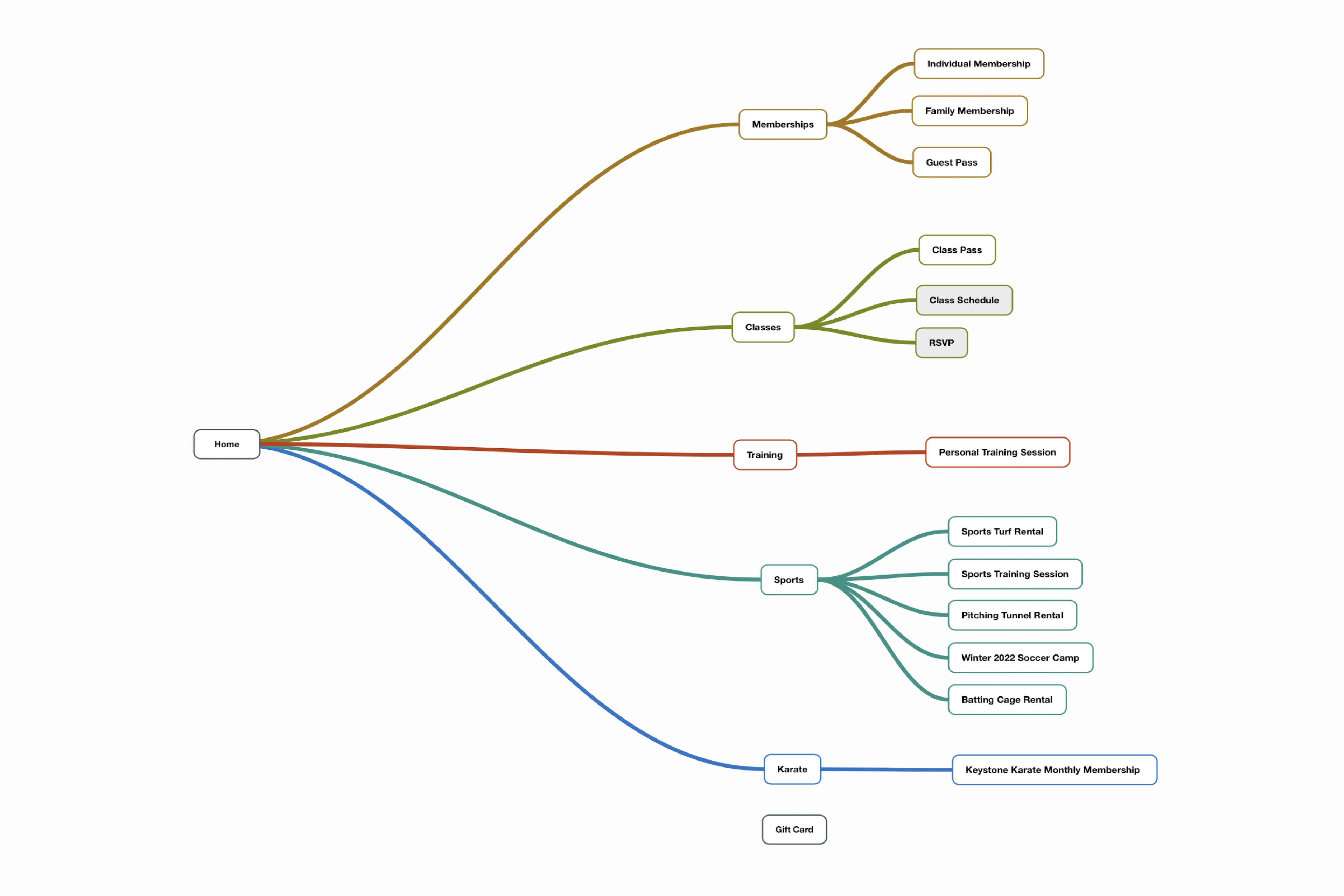
Affinity Diagraming
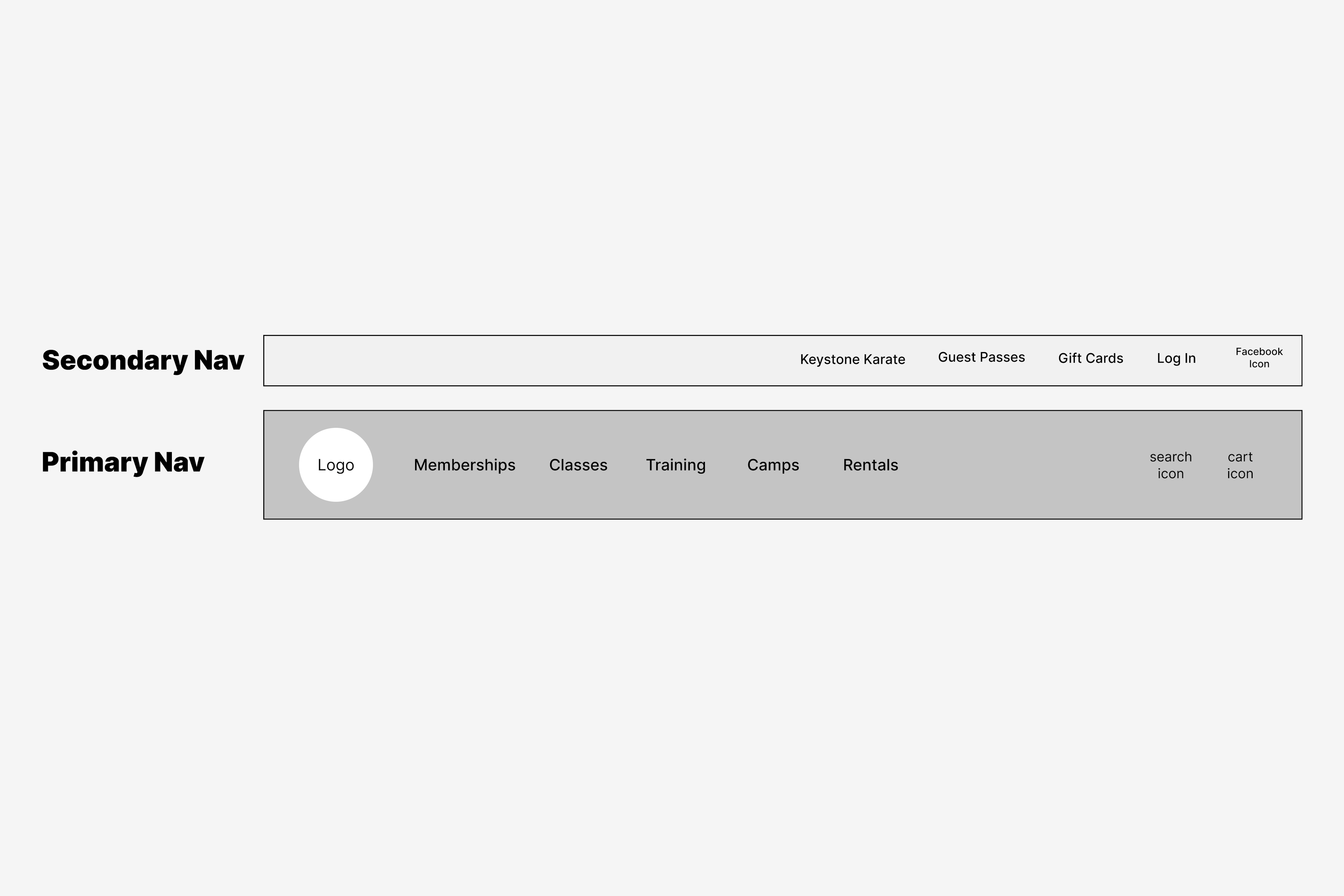
Before determining how navigation elements would be placed, I created an affinity diagram to categorize products in line with new findings. Since the amount of categories warrented a two-tiered navigation bar, I worked with stakeholders to identify which categories belonged in primary vs. secondary navigation.
Wireframing a Two-Tiered Approach
My vision for a two-tiered approach was one where a static secondary navigation sat on top of a sticky primary navbar. Hierarchy would also be expressed with color/contrast and font size.
Final Product
I developed the final product using Liquid and pure CSS for performance. The final product shipped in Ochre 3.0 on December 31st, 2021.