PYRAMID's Ecommerce Website in Shopify
To improve usability and to increase online membership sales, I lead user research, product design, and the implementation of a new website.
Client: PYRAMID
Project dates: June-December 2018


Background
Context
I was hired by PYRAMID, a sports and fitness club just outside of the Pocanos, to conduct user research and to redesign their ecommerce website. This work builds on the generative research that I had conducted in the months prior.
Approach
While our ultimate goal was an entirely new ecommerce system, iterating on the club's initial website served as a means of testing new designs in the open. In the meantime, I conducted evaluative research to help determine the most accessible ecommerce stack for members and staff. When that research was complete, I would be responsible for implementing the final product and managing its launch.
Methods
Content Inventory
It was important to understand the state of PYRAMID's digital experiences to identify room for iterative improvements. Manually inventorying content would have required a tradeoff in the volume of content inventoried or an extended period of time. To avoid this, I wrote scripts in R to scrape a collective 3000 pieces of content from PYRAMID's websites and social accounts.


Heuristic Evaluation
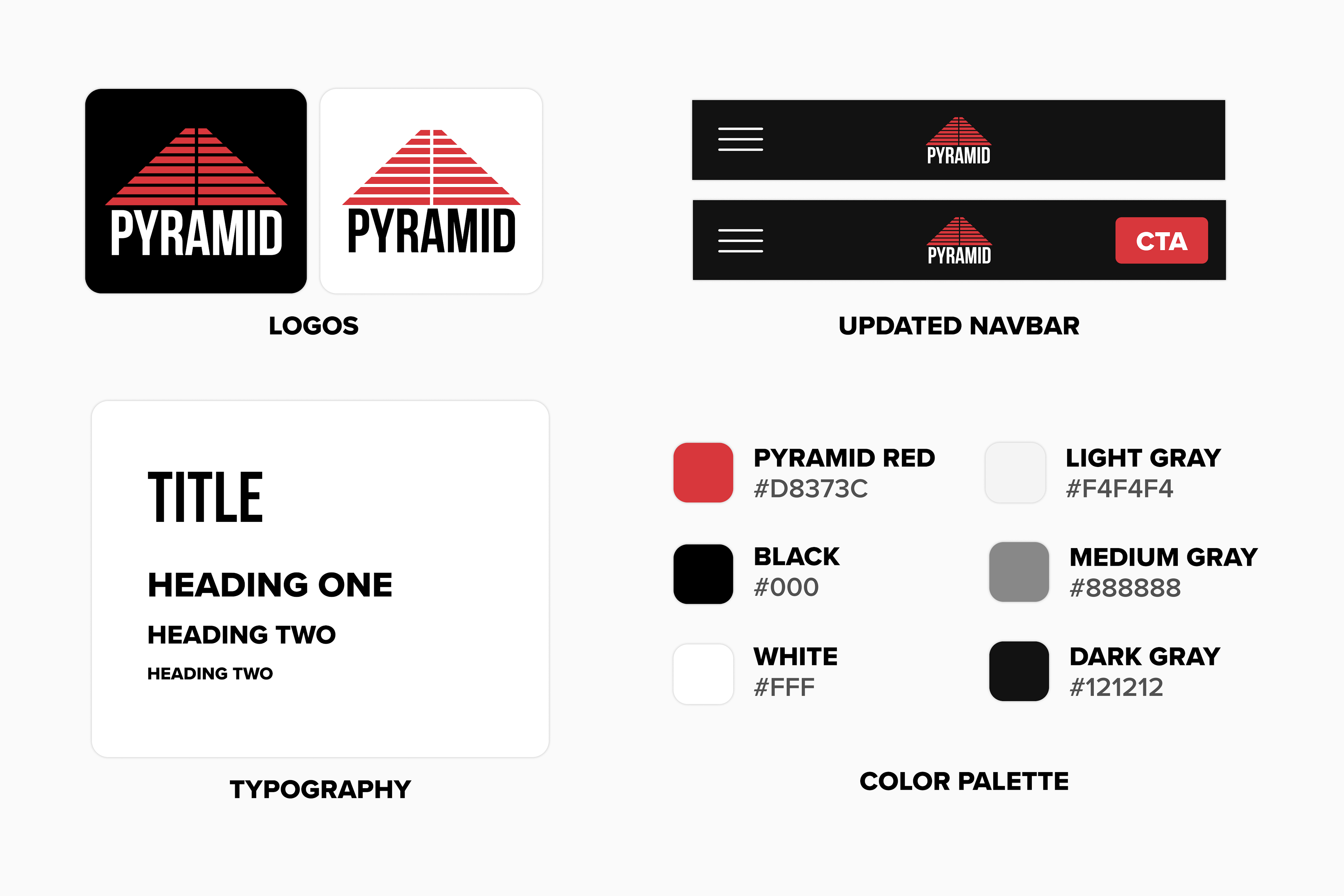
To determine which areas offered the most room for improvement, I evaluated each webpage from the content audit using Nielsen's 10 Usability Heuristics. Since the greatest areas of improvement included consistency and standards, flexibility and efficiency of use, and aesthetic and minimalist design, establishing a design system was important.
As the base of that design system, I designed updated brand assets like the club's new logos, responsive UI elements including a less-obstructive navbar, and typographic styles.

Guerilla Usability Testing
Generative research sparked the hypothesis that adopting a product page design pattern similar to brands like Gymshark would improve membership buying usability.
I constructed an interactive prototype of this flow in Sketch, and sat at PYRAMID's front desk to quickly recruit participants. I only selected participants by who had purchased a membership online in the past month.
Usability Testing Admin Experiences
With member feedback supporting our new approach, stakeholders were interested in replacing their previous ecommerce stack with one built on either Squarespace or Shopify.
To understand which service was more usable for employees, I used moderated usability tests with tasks with tasks relevant to each role. Participants used the speak aloud method while completing tasks, and filled out a survey after completing the study.
Post-test interviews showed that staff members unanimously preferred the layouts and interactions of Shopify over Squarespace.
A/B Testing Page Organization
Another remaining question from generative research was about the effectiveness of the most popular card-sorting arrangement at increasing website conversion.
Using Google Optimize, I ran an A/B test comparing conversion rates using the card-sorted navigation and the previous navigation layout.
Visitors who were served the card-sorted navigation converted significantly more than visitors who were served the previous navigation layout.
Synthesis and Deliverables
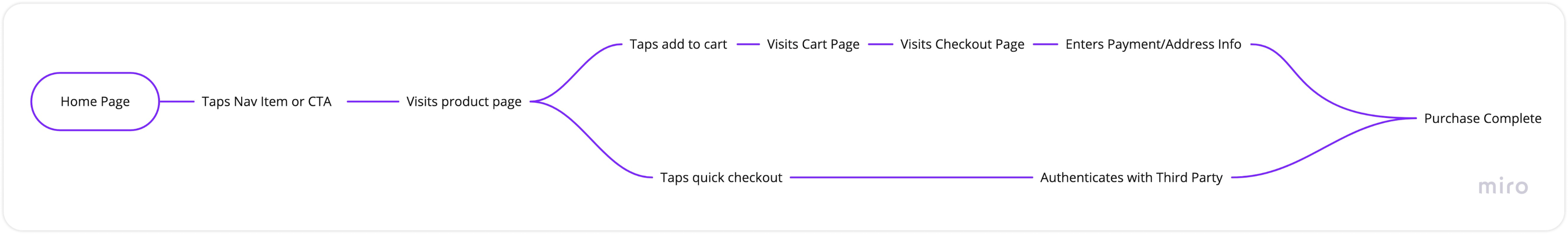
User Flows
To begin prototyping, I constructed user flows tracing each page that would need to be mocked.

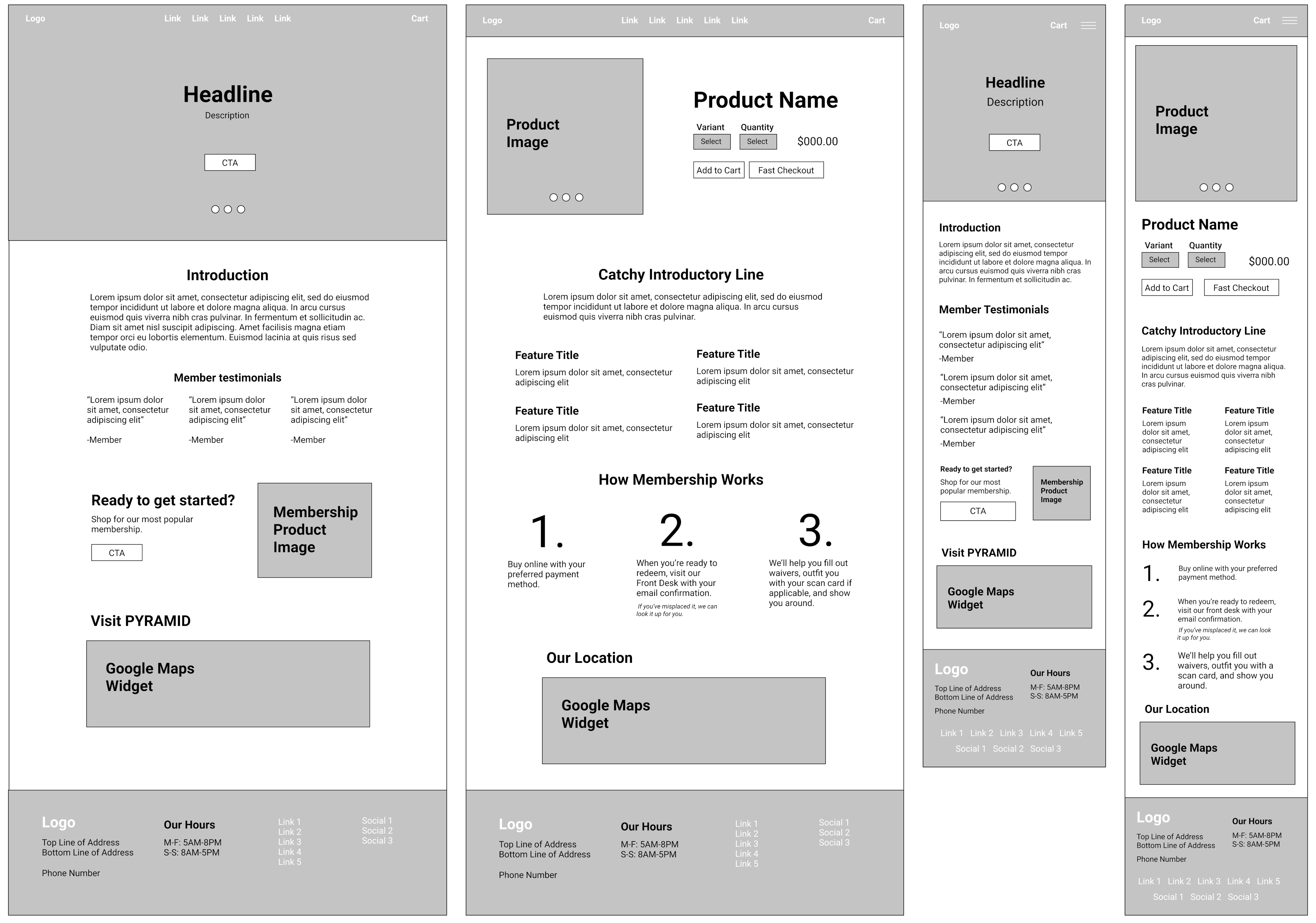
Wireframes
From those flows, I constructed wireframes of page layouts in Sketch. This was enough of a foundation was to begin designing in Shopify's page builder, since no handoff was involved.

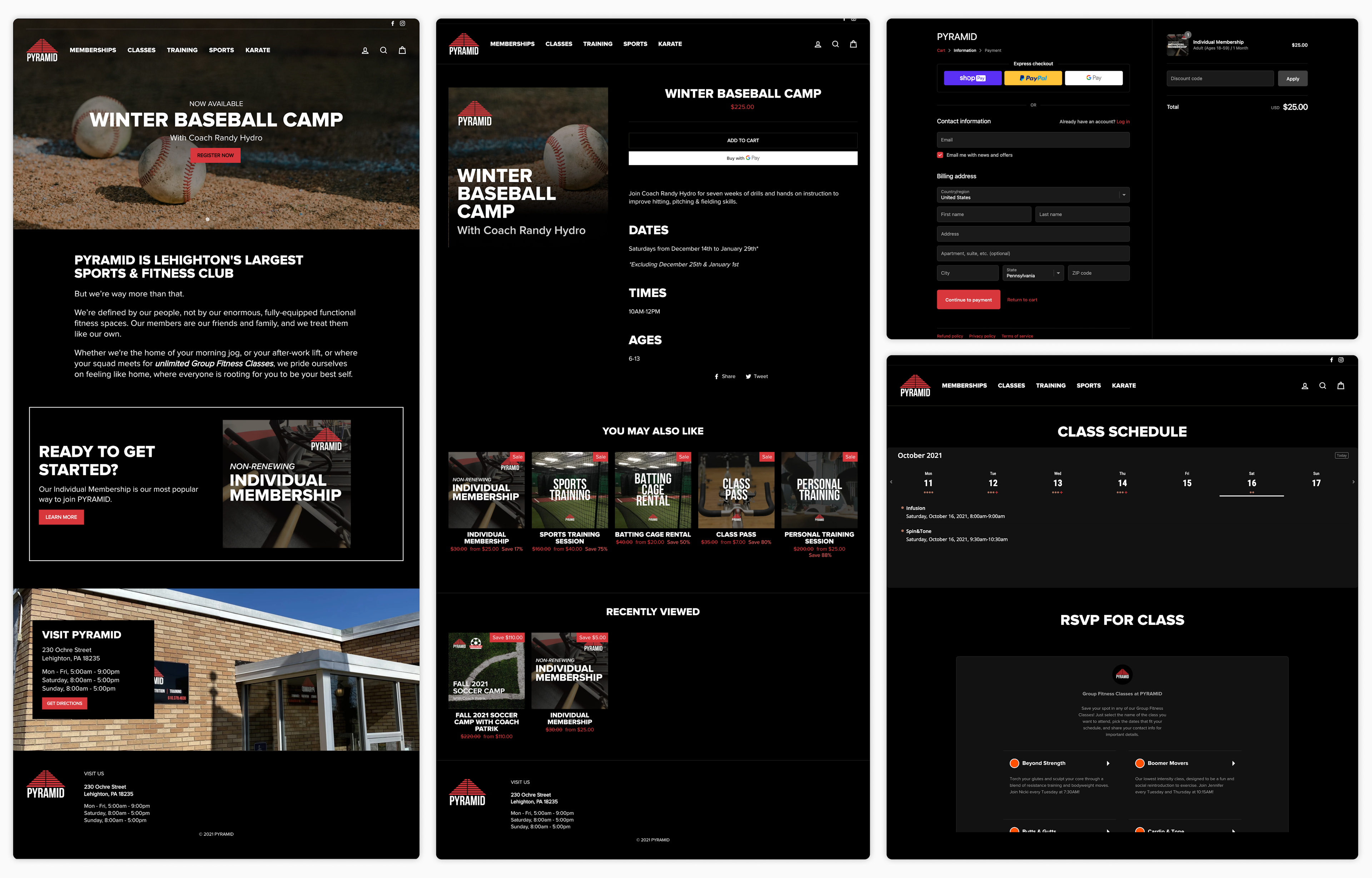
Final Product
I built upon a Shopify theme template, using Liquid and SASS to match the interface with PYRAMID's design system. The website launched one week before Black Friday, the start of the club's biggest two-month sales period.

Conclusion
Outcomes
In the first year post-launch, sales increased by 300 percent, paying for investment costs within its first month. In the two years since, sales have steadily increased, helping PYRAMID remain profitable during pandemic-related club closures.
Reflections
This project demonstrates the opportunity fitness clubs have to improve online sales by implementing shorter, more user-friendly signup processes. To date, I'm yet to see another fitness club adopt this strategy despite its success at PYRAMID. What's more, this project exposed me to the variety of ways that UX could have impact at fitness clubs, to the point that I've continued working with PYRAMID for the past three years.